

Client
Glimps
Glimps
Industry
SaaS
SaaS
Services Provided
Creative Direction Visual Identity Brand Guidelines
Creative Direction Visual Identity Brand Guidelines
Help buyers realise your aha moment faster
Help buyers realise your aha moment faster
More than just a software, Glimps is community and movement that puts buyers first. No more rings of fire to get through to see what the software you want to buy actually does - get a Glimps of value immediately.
More than just a software, Glimps is community and movement that puts buyers first. No more rings of fire to get through to see what the software you want to buy actually does - get a Glimps of value immediately.
Project goals:
Project goals:
→ Win on brand → Differentiate and stand out in a competitive market → Create an ownable identity that shares their mission and story → Resonate with B2B market and position to sell at a premium
→ Win on brand → Differentiate and stand out in a competitive market → Create an ownable identity that shares their mission and story → Resonate with B2B market and position to sell at a premium
Approach & Strategy
Approach & Strategy
You get two type of brands: those that evolve and those that rebel. Glimps rebels. Traditional B2B businesses are known to be serious and flat. They wanted to change that.
Being an early-stage startup, their goals was to outmanoeuvre their competitors through the use of their community. This meant trust and transparency with their audience. The quickest way to NOT connect with your audience is to be a stale, boring traditional B2B business. So, Glimps became a fun, personal, informal brand. Whilst still positioning as a premium option to attract and sell to c-level business owners.
So they needed to appeal B2B, but like B2C.
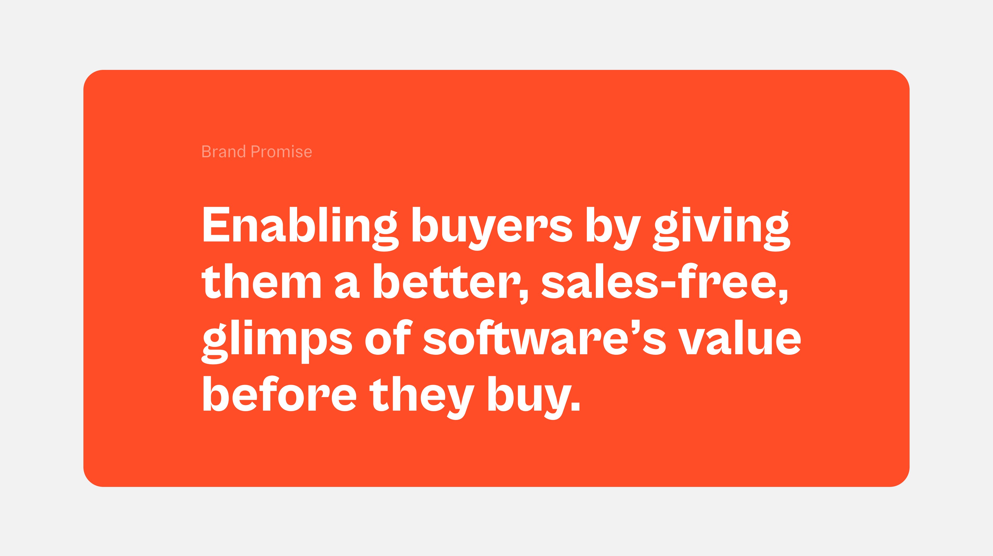


Objectives and process
Objectives and process
Work included:
→ Brand strategy
→ Creative direction
→ Conceptual ideation
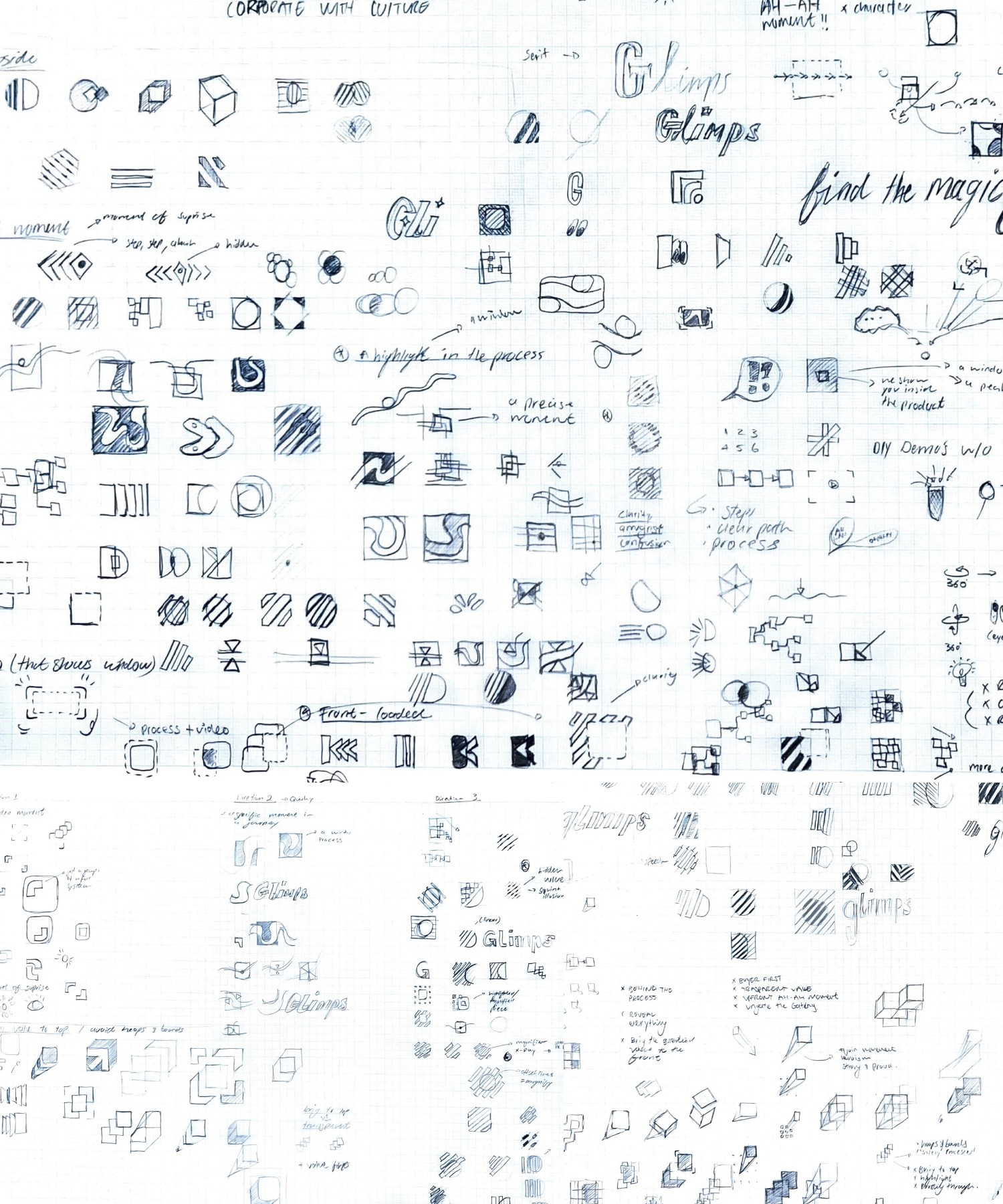
We had multiple conceptual narratives to play off and pursue, some being:
A moment in a process
Clarity in confusion
The value realisation
The perfect moment
Magnified value
Bring the value to the front
After exploring each, visually and conceptually we landed on the idea, "the aha moment". This was the our conceptual foundation going forward into the creative process.
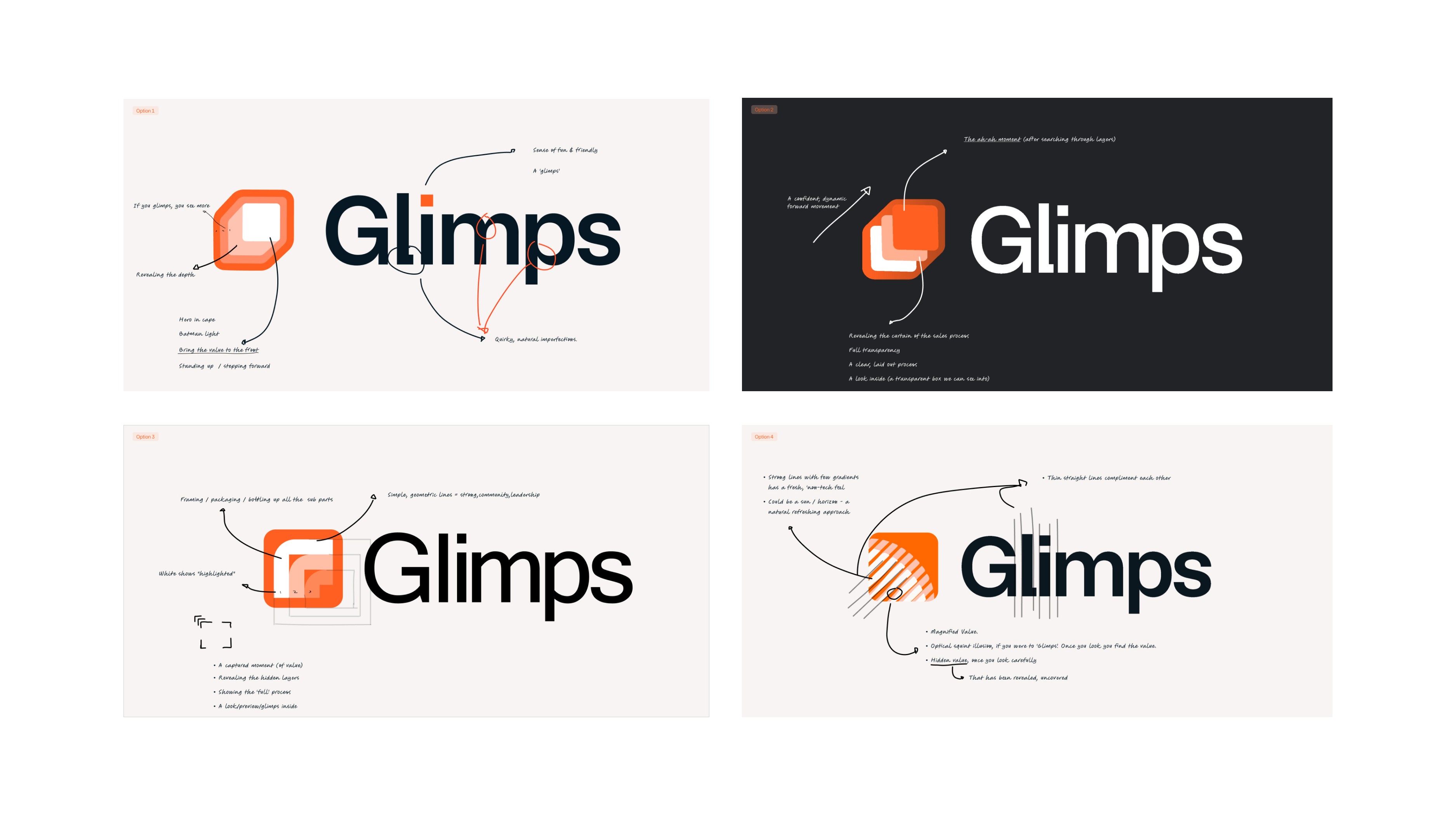




Creative Solution:
Creative Solution:
Work included:
→ Stylescape boards
→ Visual identity sprints
→ Logo system
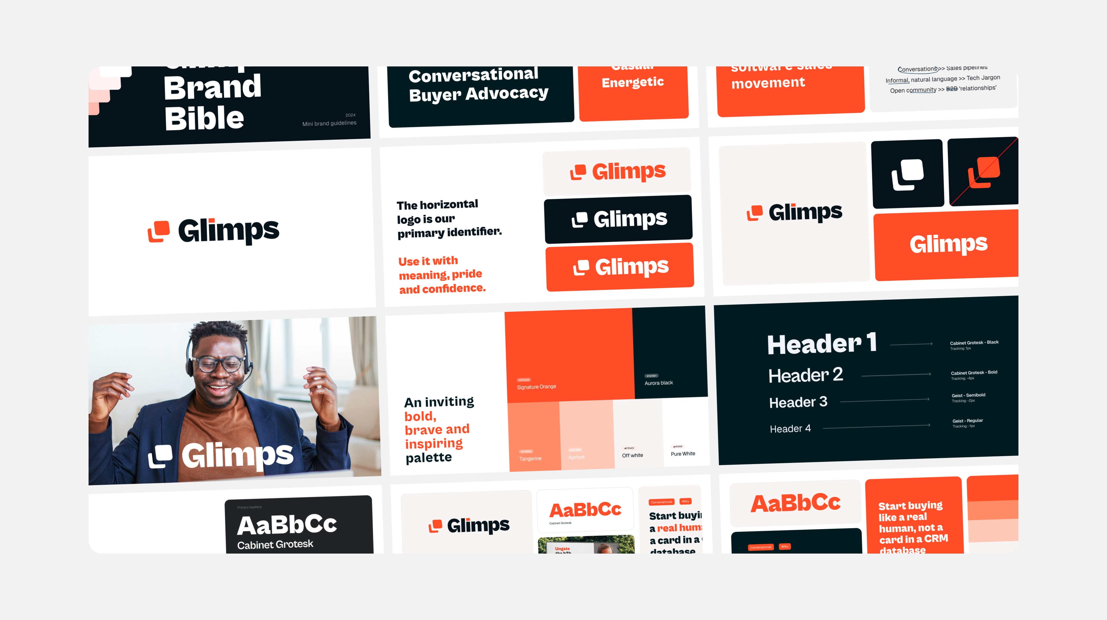
→ Type, Colour and Layout system
→ Art direction
→ Brand Guidelines
Verbal Identity:
Glimps is a brand not afraid to roll up their sleeves and let their top button lose. Light-hearted and witty. However, assuring and confident.
At a higher level, Glimp's fun and fresh tone of voice is a stance against the over traditional, boring B2B competitors. Their tone of voice is the cornerstone of their strategy to position as the first and only product that keeps the buyer front and centre at all times.
Visual Identity:
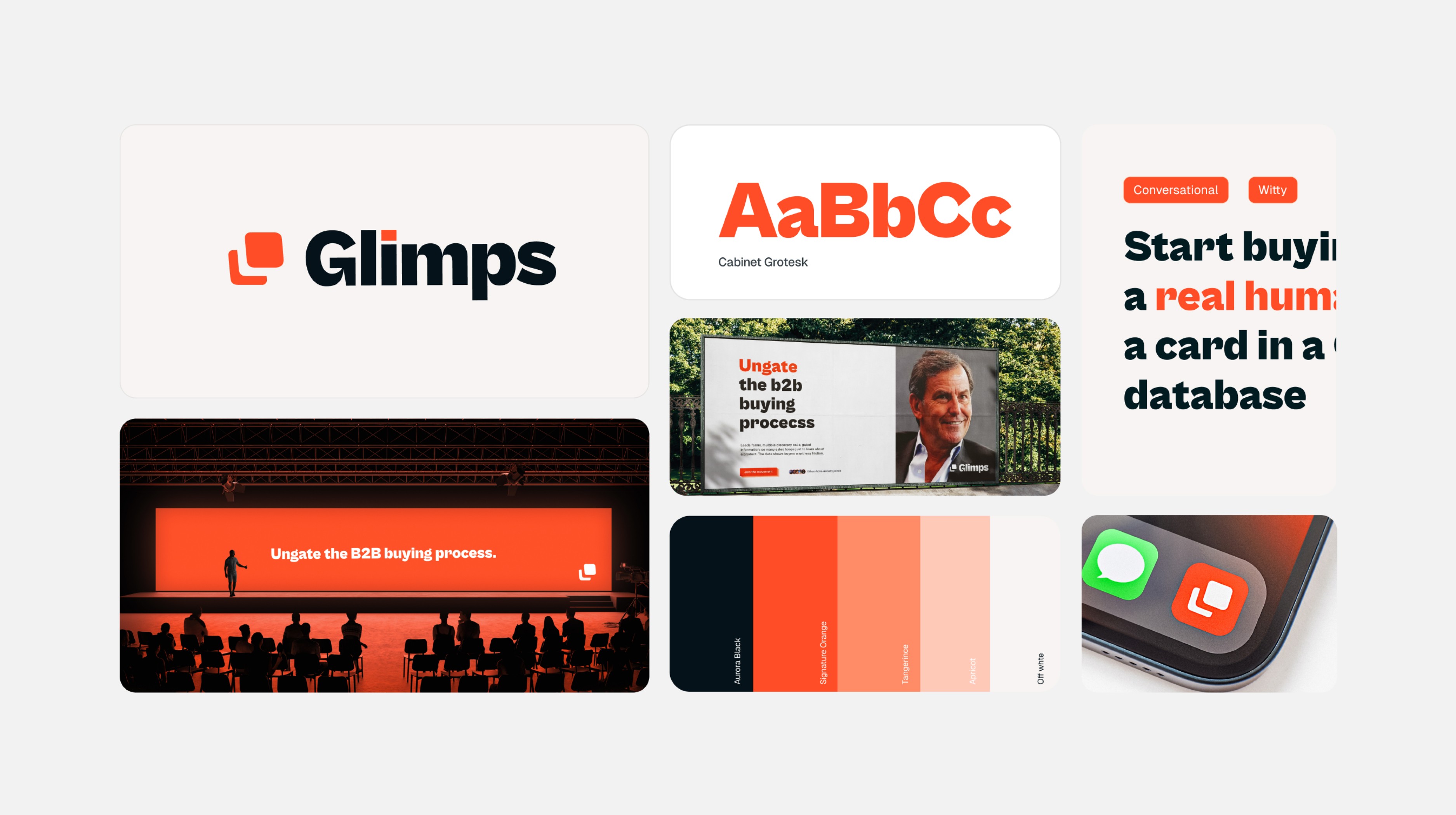
Their primary typeface screams, 'fun and friendly' from a mile away. Paired with a pure, vibrant orange the Glimps visual identity stands out tall and proud amongst their more stale competitors.
Logo:
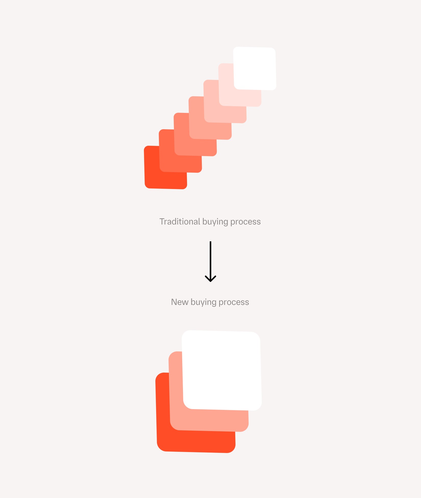
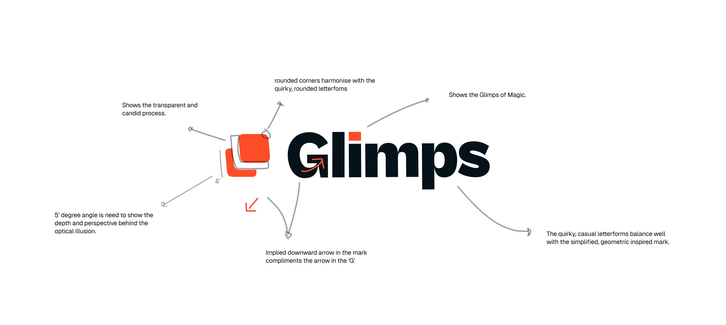
Their final mark, a simplified 3D layered block acts as their batman signal. At a glance, a strong, dynamic symbol for buyers to stand behind. On a conceptual level, the mark shows an abbreviated shorthand of the old buying process. The 3D optical illusion highlights the front block coming forward, echoes their strategy to bring value to the front and cut out any unnecessary steps in between.





Results
Results
→ An ownable and identifiable identity as a vehicle to share their story
→ Clarity and direction in brand
→ Distinct visual identity to increase engagement and awareness on social media
Client Testimonial:
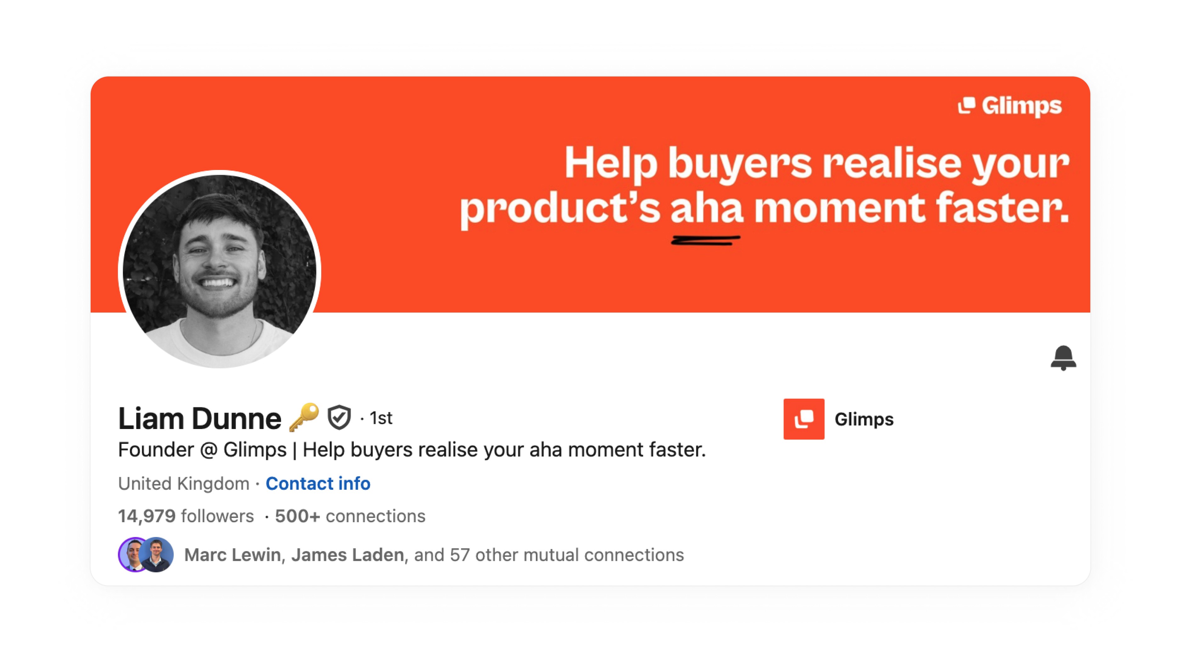
" A breathe of fresh air to work with. Josh brought this brief to life with little to no micro-managing. Saved me dozens of hours and I've already been receiving compliments on our visual identity."
~ Liam Dunne | Founder @ Glimps







“increased our CLV & customer loyalty."

Co-Founder at GrowSaaS

Co-Founder at GrowSaaS

Co-Founder at GrowSaaS
"increase the value of your company"

Founder @ Glimps

Founder @ Glimps

Founder @ Glimps
"clear interest to investors"

CFO at TAZAAR

CFO at TAZAAR

CFO at TAZAAR
Have a vision?
Let's make it a reality.
Be quick - there are limited seats for Q1 2025
