

Client
Tech Hubble
Tech Hubble
Industry
Networking Platform
Networking Platform
Services Provided
Creative direction Visual Identity Logo
Creative direction Visual Identity Logo
Networking for industry leaders
Networking for industry leaders
TechHubble is a growing networking platform for tech professionals and business leaders. Their goal is to facilitate meaningful connections and relationships that grow careers, people and businesses. Every business is meeting one person away from changing their lives, Tech Hubble finds that person for you.
TechHubble is a growing networking platform for tech professionals and business leaders. Their goal is to facilitate meaningful connections and relationships that grow careers, people and businesses. Every business is meeting one person away from changing their lives, Tech Hubble finds that person for you.
Project goals:
Project goals:
→ Attract business leaders → Carve out their own niche in the market → Balancing an authorative business with an inviting personality
→ Attract business leaders → Carve out their own niche in the market → Balancing an authorative business with an inviting personality
Approach & Strategy
Approach & Strategy
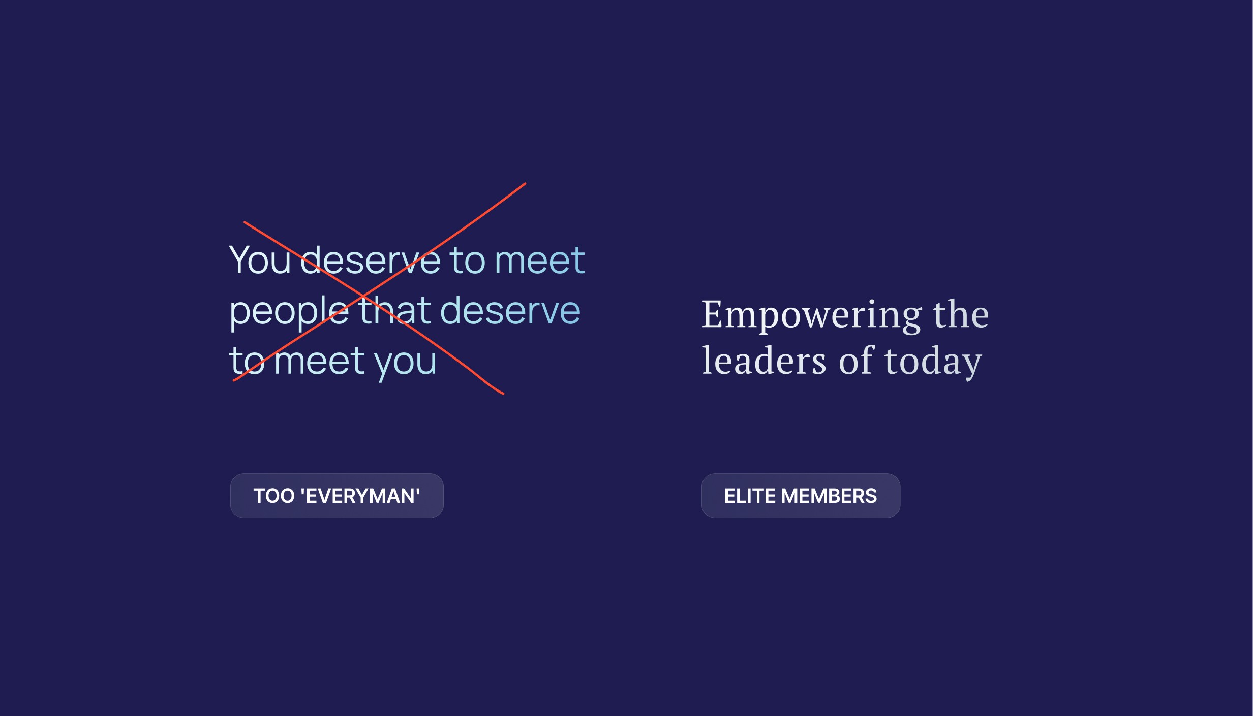
We had a clear idea of where TechHubble needed to be (the sought-after networking platform for the world's leading professionals) but we had no idea how that was going to look. For TechHubble to be known as the 'best' platform we needed to carve out our own niche in the market, a specific narrative and identity. After our stategy we had more clarity. Which lead to our next challenge. We needed to shape up as an elite, top-performing brand whilst still being inviting and people-first. Here's how we did it.
Tech Hubble's business model and customer base are split in two, b2b and b2c. They connect aspiring professionals with future role models as well as introduce business owners to new partnerships. After collaboration, research and strategy we found this was the backbone of the personality of our brand. Firm, trustworthy and sophisticated but with a soft spot for their people. We needed to strike a balance between being extremely professional and still being inviting to new members of the community. They are connecting real-life genuine people to people after all.


Objectives and process
Objectives and process




Creative Solution:
Creative Solution:
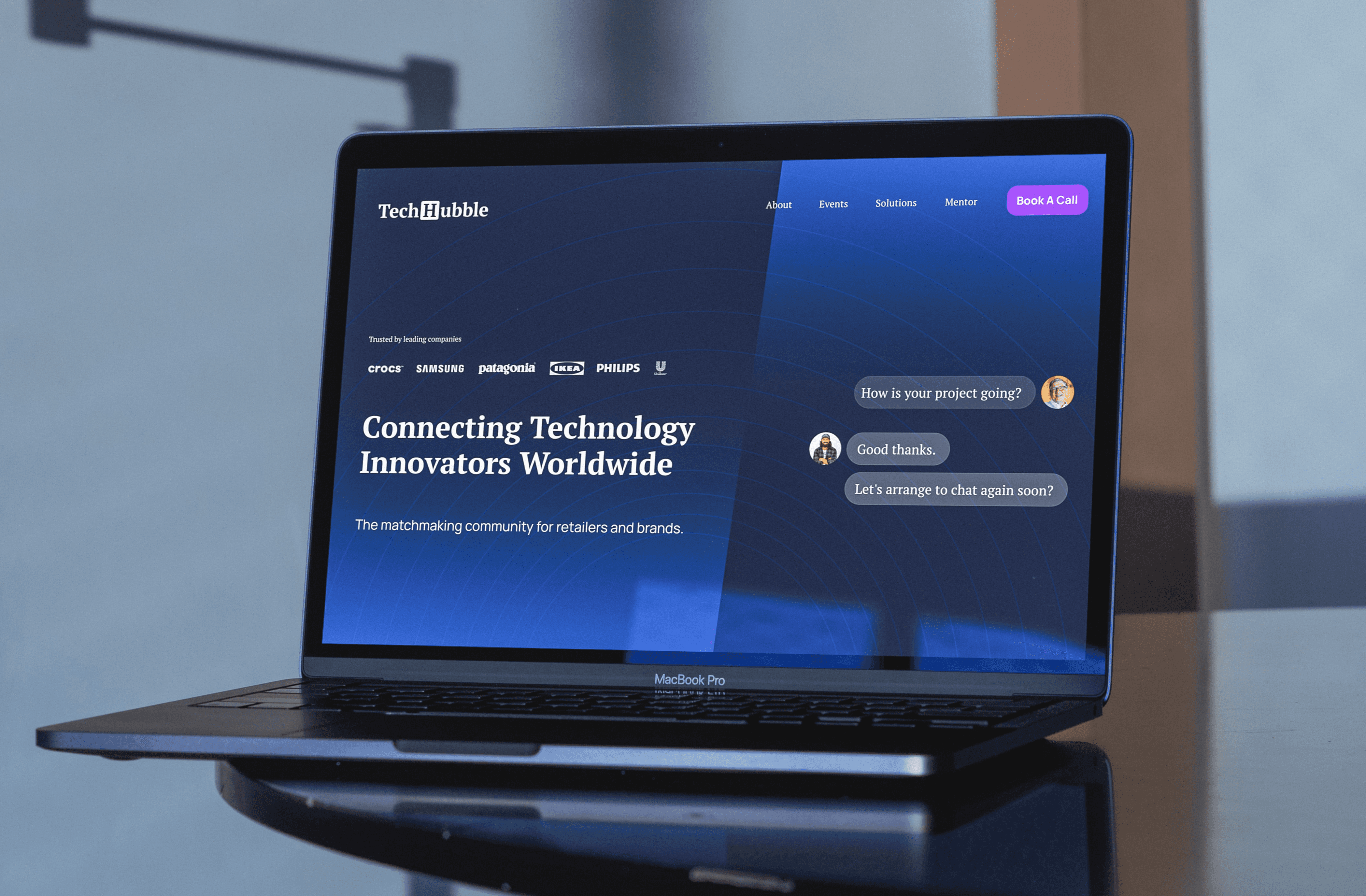
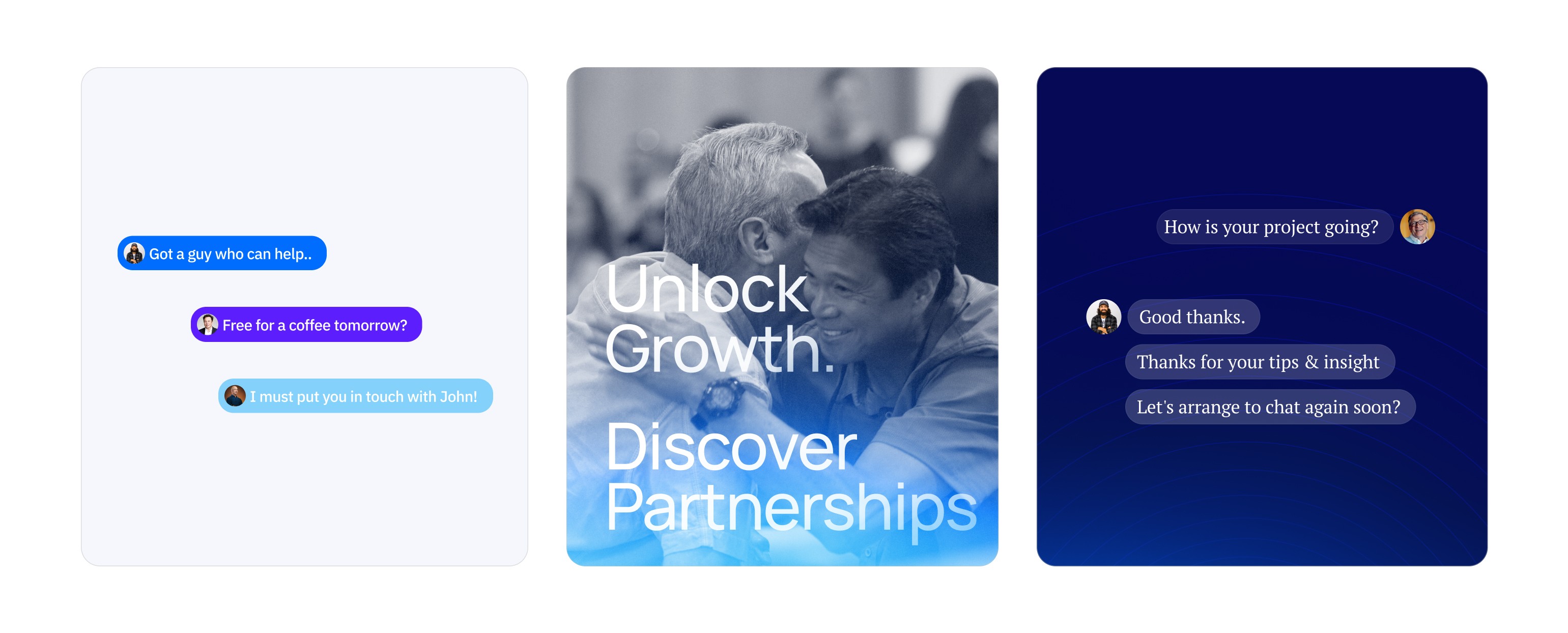
We lead with a 60% ruler archetype, with strong blues, corporate serifs and formal language positioning them as an authority in the market. Our extended visual language plays with the idea of text blocks showing the connection of real people. Everyone is serious and professional until you start working with them, then you're best buddies. This embodies the Tech Hubble brand to a tee.
Logo:
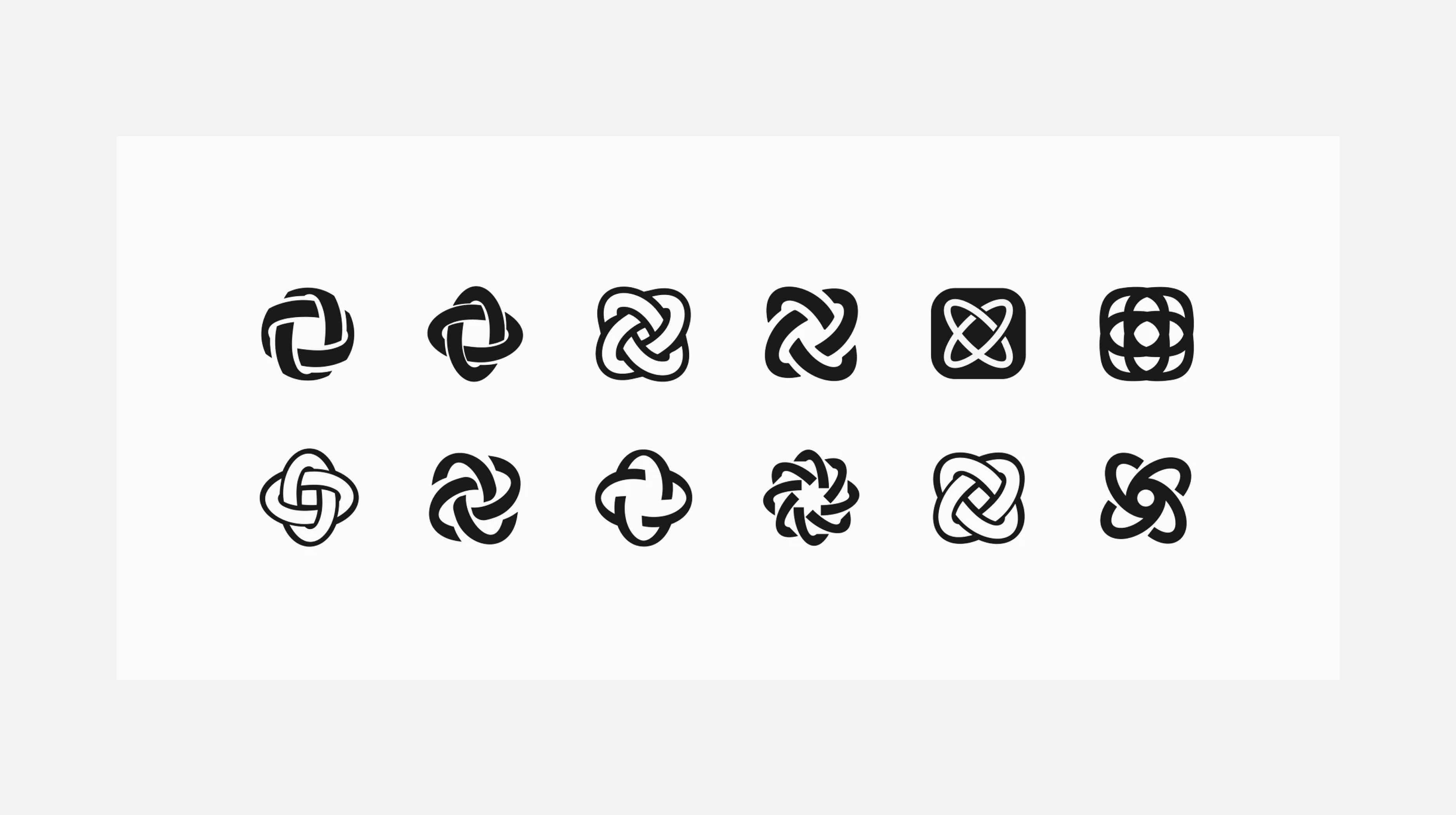
The mark was looking too similar to a global corporation or enterprise. From our strategy, we knew we needed a more friendly and approachable feeling. So we moved to a word mark. Clean, 100% unique and timeless. The serif lettering derived from PT Serif, used in Forbes Magazine, was the perfect balance of a corporate, professional yet warm and slightly laid-back look and feel to it.
Visual Identity:
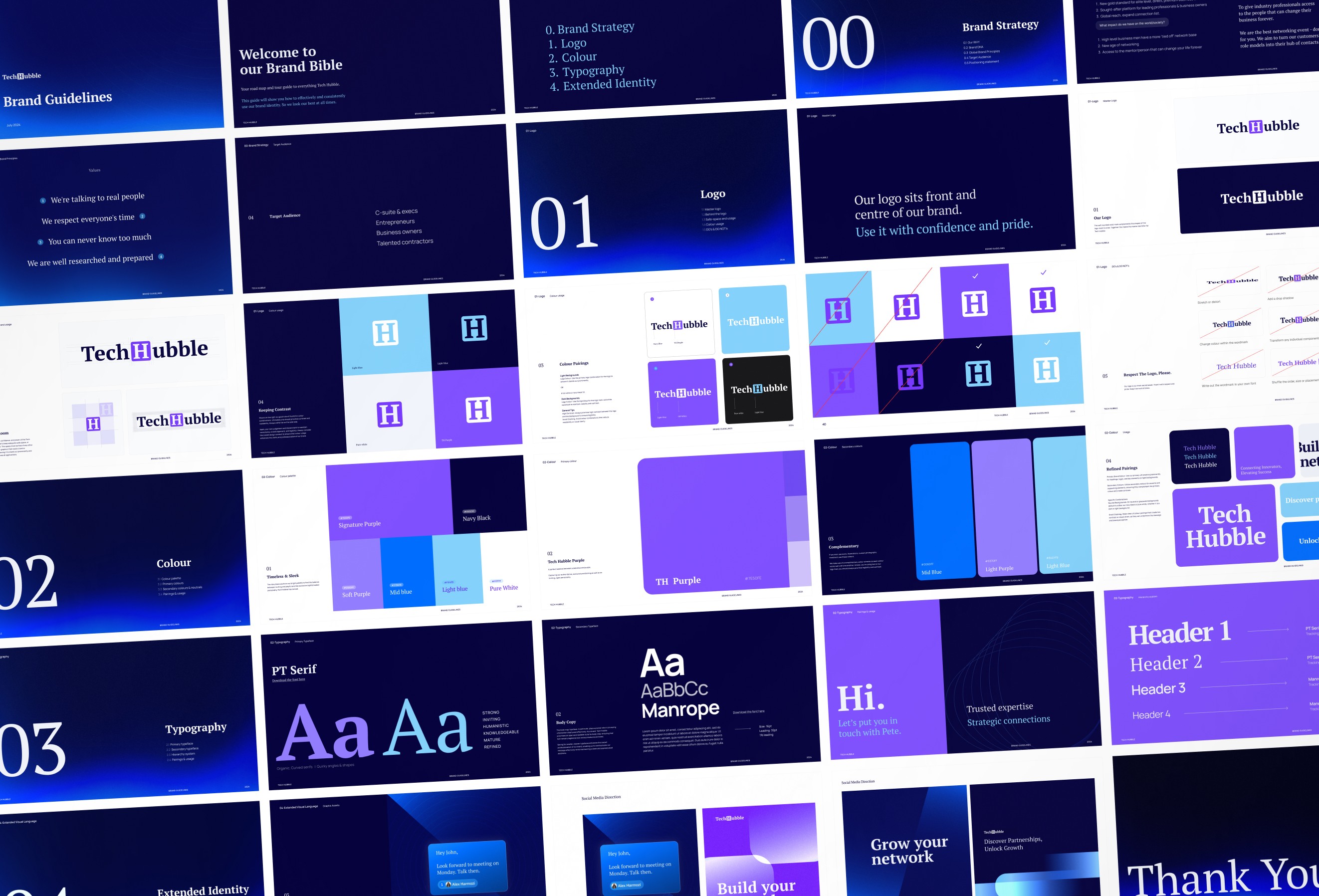
Dark vibrant gradients, chat boxes, real people's faces, thin corporate serifs, inviting bold-weighted type, elegant graphic patterns and playful blue accents. Together this is Tech Hubble. Right in the middle between exclusive and inviting. At a stage we realised that the brand was looking too corporate and authoritative, scaring new members away. We hit the drawing board, dialled it down with less use of the corporate rich blue and started to include more playful purple. Less extreme geometric shapes and gradients and more chat bubbles and text blocks. Showing the power of facilitating genuine people-to-people connections through their platform.
The primary typeface, PT Serif, is the most recognizable element of our identity. Both the bold and regular weight bring their sense of personality that together make the Tech Hubble brand. The majority of the branding is done over their dark navy blue (dark mode) to ensure their sense of professionalism, class and leadership. We want people to feel invited and included into a high-performing exclusive environment. A first of its kind approach. When people think of a networking platform for elite leaders and professionals they think of TechHubble.








Results
Results
Before:
→ Struggling to attract c-suite level leaders and business owners.
→ Weak, unclear positioning (just another option in the market).
After:
→ A clear idea of exactly who TechHubble is. How they speak, what message they getting across and to who.
→ 1-of-a-kind visual identity has helped him get a firm grip in his market.





“increased our CLV & customer loyalty."

Co-Founder at GrowSaaS

Co-Founder at GrowSaaS

Co-Founder at GrowSaaS
"increase the value of your company"

Founder @ Glimps

Founder @ Glimps

Founder @ Glimps
"clear interest to investors"

CFO at TAZAAR

CFO at TAZAAR

CFO at TAZAAR
Have a vision?
Let's make it a reality.
Be quick - there are limited seats for Q1 2025
